Optimising the industry engagement funnel
I restructured the University of Sydney’s industry engagement pages to make the engagement options easier to scan and to increase click-through rates.
I was provided a very loose brief…
"improve the industry section of the university site".
The University's industry section explains how industry can engage with the university across student programs, research collaboration, licensing opportunities, consultancy services, and more.

⛔️ I had some contrainsts…
I started by collecting more information to understand where problems may lie
How I gathered information
What I learned
Decentralised ownership
A central engagement team exists, but most engagement happens in faculties, each with their own sites, standards, and content quality.
Confusing offerings
The offer wasn’t packaged clearly: “how to work with us” wasn’t obvious.
No clear starting point
Pages didn’t answer “where do I start?” and buried the next step.
Metric challenges
‘Conversion’ pages varied wildly (forms, emails, phone numbers, faculty landing pages), so measurement needed a pragmatic definition.
Low appetite for change
Key stakeholders were time-poor and resistant to edits, so the work needed to prioritise minimal, high-leverage improvements.
Poor web content and design
The pages lacked basic web patterns: inconsistent page types, weak hierarchy, and a lack of clear purpose.
I then scoped out a clearer project brief
Once it was clear a lot of the issues were structural and slow to fix, I set a timebox (a few months) and focused on what we could improve quickly and measure reliably.
Objective
Improve performance of industry service pages.
I focused on removing noise and making the next step obvious, so more visitors progressed from high-level pages into real engagement opportunities.
KPI
CTR to next conversion point for any given page
Because conversion endpoints varied (and were often owned by faculties), we measured success by click-through to the closest actionable step.
Scope
"Central-owned" service pages incl. category pages
The industry landing page and the key category/service pages within the central section that we could update, publish, and measure. We will NOT attempt to fix the downstream faculty pages, forms, or processes.
Timeline
3 months
A short cycle to ship measurable improvements and leave a clear set of recommendations for anything bigger.
I created a repeatable page recipe so we could scale improvements across the site section
I worked with another UX designer on this section. The recipe below made the work easier to distribute and helped keep decisions consistent across different page owners and approval constraints.
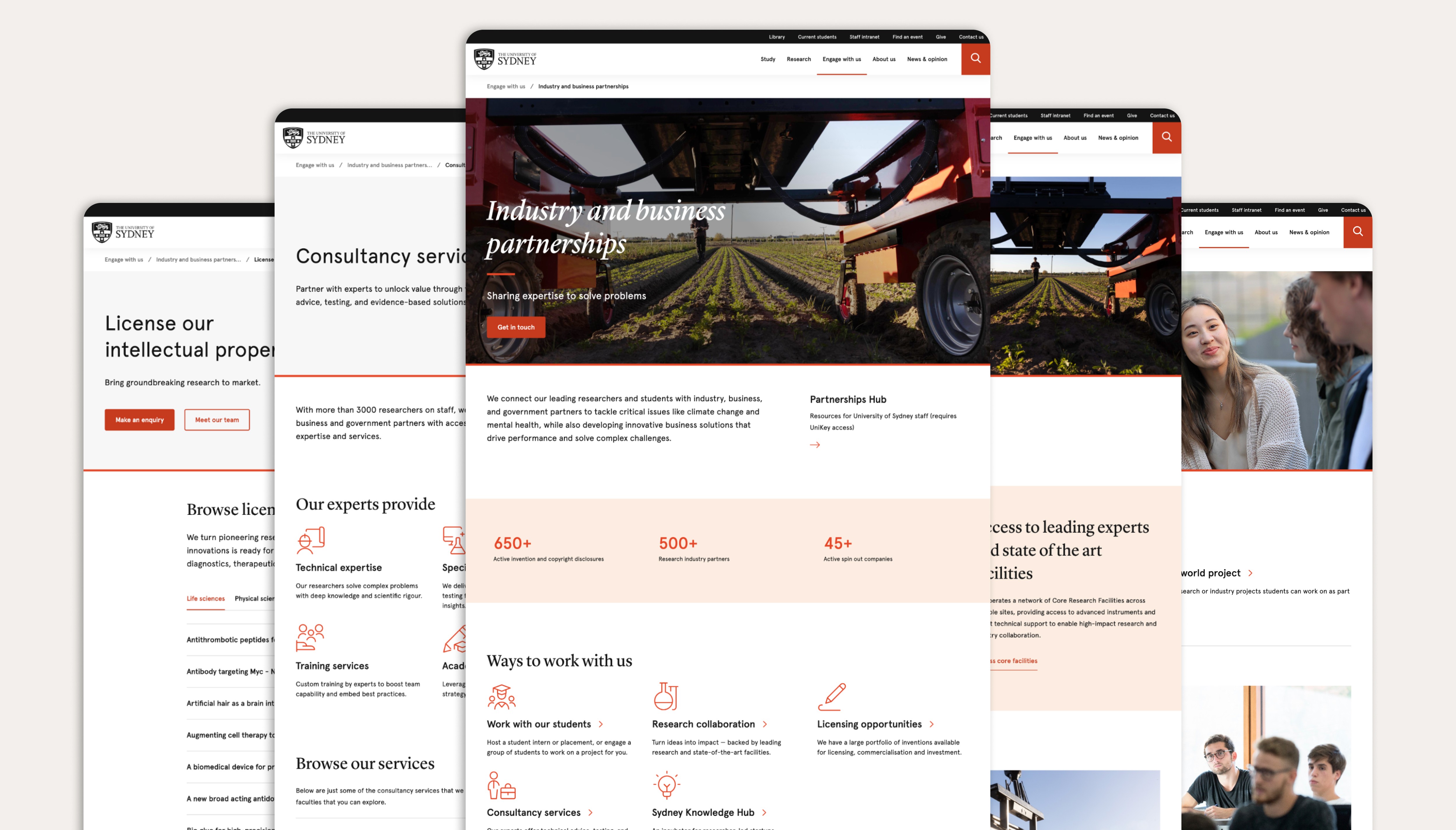
Industry section landing page
Page purpose
Introduce the overall offer and help industry quickly choose a pathway (category) to the right type of engagement.
Key changes
Options were buried behind long text and competing content (stats, links, accordions).
Made the 5 engagement pathways the hero (icon grid near the top).
Reduced to one primary CTA (“Get in touch”).
Moved proof (stats + stories) below the pathways.
Added a consistent “Not sure where to start?” banner as the fallback.
Result
+85% CTR to engagement categories i.e. “Ways to work with us”.
Screenshots
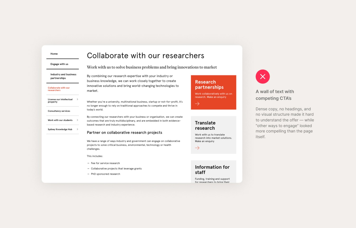
Research collaboration page
Page purpose
Help partners understand how research collaboration works and give them one clear way to start a conversation.
Key changes
The original page used a 3-column layout with too many competing actions (right-rail CTAs, tools, funding links, repeated nav).
Rebuilt as a single-path landing page.
Added scannable sections with clear headings (no walls of text).
Promoted one primary CTA (“Get in touch”) near the top.
Kept success stories as supporting proof at the bottom.
Pushed low-priority links down into the banner area.
Result
+63% CTR to 'get in touch' call to action
Screenshots
Host a student intern page
Page purpose
Help employers understand the value of hosting an internship/placement and take a clear next step to set one up.
Key changes
Pulled “why host an intern” benefits out of an accordion and turned them into scanable icon tiles near the top.
Removed redundant accordion interactions for “browse by faculty” and made faculty pathways easier to find and click.
Simplified “how to get involved” from mixed text links into a clearer, more deliberate pathway.
Reduced competing options (e.g. CareerHub/job ads) and centred one primary action: “Get in touch”.
Added a second soft CTA banner near the end of the page to catch users who need reassurance after scrolling.
Result
+22% CTR uplift to get in touch CTA.


